

Rocket.net Review Based on Real Experience – Why We Moved to Rocket.net

There’s no shortage of hosting providers out there. At Atarim we were already using what was considered to be the fastest managed hosting. So when we saw Rocket’s claim of being the “World’s Fastest WordPress Hosting”, we took it with a pinch of salt. 

And boy – were we wrong. For Atarim’s website presence, we needed a host that matched our ambitions, and Rocket.net delivered with aplomb. 

In this post, we are going to go over Rocket.net’s hosting service and tell you just what convinced us to switch hosts – and move to Rocket.net. 

Rocket.net – An Introduction

rocket net review

Rocket.net is a managed WordPress hosting provider that was founded in 2020. The company was the first managed hosting platform that came fully integrated with Cloudflare Enterprise, which is definitely a plus. 

The company’s headquarters are located in West Palm Beach, FL, and they are fully remote. The company has more than 250 server locations that they use to offer caching and security services. 

They house their hosting servers in Internet Exchanges, with each exchange connected directly to a local ISP, which helps reduce latency and increases speeds.

Rocket.net claims that this offers faster TTFB (time-to-first-byte), full page caching, and significantly lower latency as a result. They also have 15+ Edge Hosting Locations, which is essentially a data server that’s installed within an Internet Exchange. 

Server Infrastructure Designed for WordPress

One of the things that we really liked about Rocket.net was that their infrastructure is really optimized for WordPress websites. They use an optimized stack that integrates Cloudflare Enterprise and improves performance, no matter the nature of your site. 

Rocket.net servers offer built-in caching, NVMe drives (which significantly improve performance), and are powered by NGINX. Every WordPress install is cached automatically and is secured by the Cloudflare Enterprise Network, which further improves content delivery.

Full Control Over Your WordPress Site

You don’t need Plesk or cPanel with Rocket.net. Rocket.net’s dashboard is clean and thoughtfully designed, offering you important information and controls right where you need them. 

rocket net dashboard

You can deploy WordPress in a single click, test out new features in a dedicated staging environment, and you can even bring on more users and assign them roles to create a proper team. 

Other features include 2FA support, and here’s one of the things that we really liked: free migrations! The team at Rocket.net was kind enough to manage the migration of our site for us, which happened quickly and seamlessly. 

For a site like Atarim, we wanted to make sure that it was moved in its exact condition. Their team was incredibly helpful in managing the migration and made sure that everything went smoothly. 

And the instant performance boost right after was definitely the cherry on top!

Pricing

We know how important pricing is for new customers, and compared to other providers, it’s plain to say that Rocket.net isn’t the cheapest hosting provider out there.
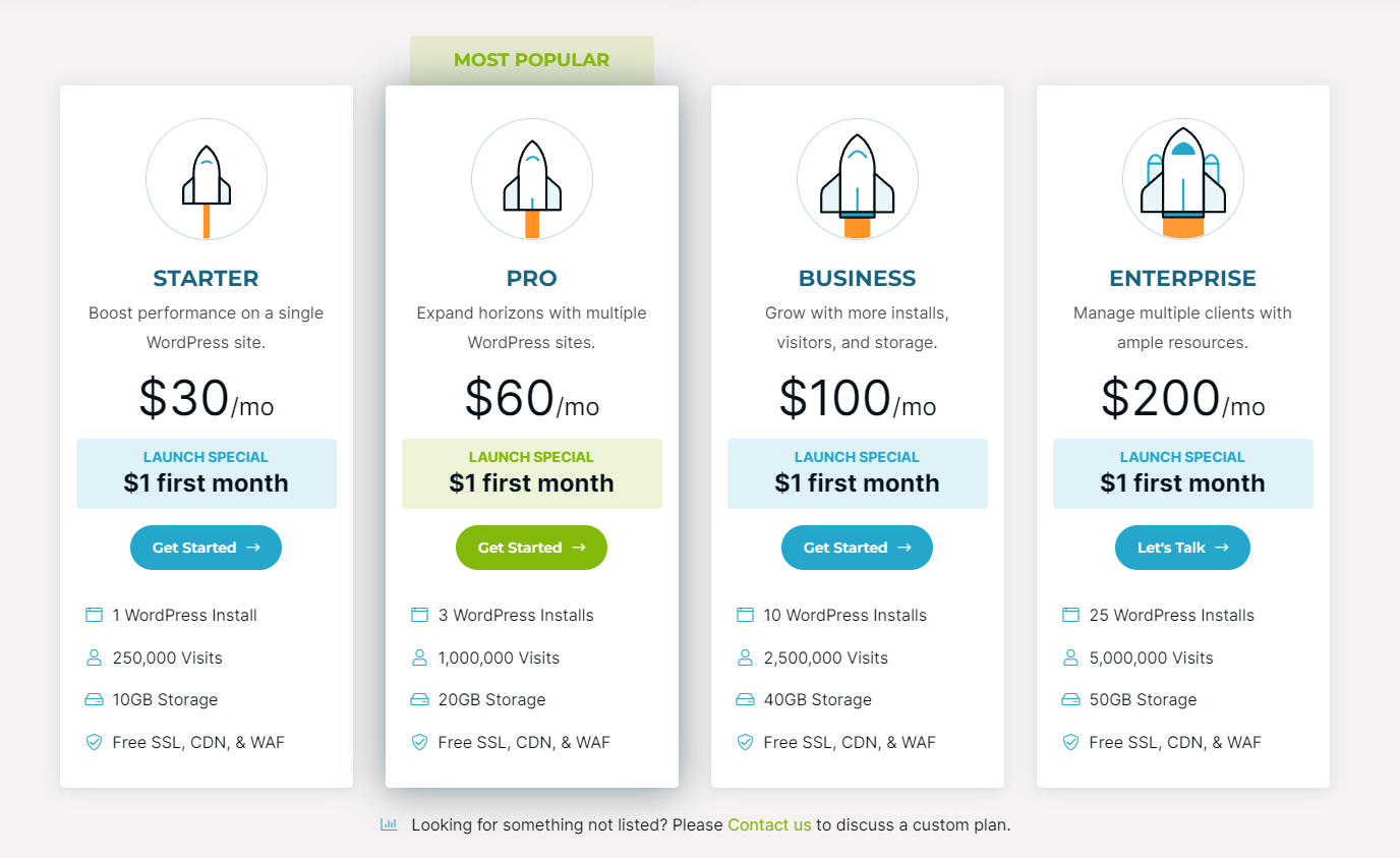
You can also get started for $1 here

That’s their base annual payment structure for their managed hosting. Obviously, if you want enterprise hosting or need a custom solution tailored to the needs of your agency, you’ll have to pay more. 

But, their basic plan comes with a bunch of amenities, including:

  • Web Application Firewall (WAF)
  • Automatic database optimization
  • Hands-free migration
  • 30 days money-back guarantee (included with all plans)
  • 20+ server locations 
  • Multisite support
  • 14 days backup retention
  • Automated backups on a daily basis
  • Git integration
  • SSH access
  • Automatic plugin and theme updates
  • Automatic WP Core safe updates

Incredibly Fast Performance

rocket net performance in speedvitals

Here’s how Atarim fares in terms of TTFB across Europe, as measured using SpeedVitals. As you can see, Atarim does quite well across the board. And, here’s the global performance map:

global performance view

The speed boost was instantaneous:

speed after moving to rocket net

For those who know a thing or two about hosting, you may appreciate just how powerful this is. An optimized, fast-loading website is critical for a tool like Atarim, and that’s just what we get with Rocket.net.

Cloudflare Enterprise Beats Out the Competition

First off, we know that there are other providers that offer Cloudflare Enterprise right out of the box. But Rocket.net does a better job of integrating it into its core platform. 

For starters, Cloudflare Enterprise is free and automatically deployed on every website that you launch. You can access all 270+ Cloudflare PoPs with Rocket.net without doing a thing. 

And many of Rocket.net’s servers are situated in the same data centers as Cloudflare’s. Other competitors often charge a small fee per domain to use Cloudflare Enterprise, and some require you to configure it too. 

With Rocket.net, there’s nothing to worry about. The moment you launch your server, everything’s configured without any hassle. 

You also get added benefits like Argo Smart Routing and Tiered Cache (which detect traffic congestion in real-time and reroute the traffic through the fastest paths). 

Unlimited PHP Workers 

Another thing that we really liked about Rocket.net is that you don’t have to constantly worry about upgrading PHP worker limits or enhancing the CPU limits. Rocket.net doesn’t limit your PHP workers since they use Cloudflare Enterprise so effectively. 

Unrivaled Customer Support

We’ve already touched upon this, but this definitely deserves a separate section. Rocket.net’s support is exceptional, and we know just how important good support can be for retaining customers. 

They have a team of professionals who are available 24/7 to answer questions. They offer support via email, and phone, and you can also use their live chat. Every time we’ve contacted them, we have been pleasantly surprised at just how prompt the response was.

Robust Security Stack 

Security is obviously going to be a major concern for you. Rocket.net excels on this front, as it uses two firewalls: a website firewall and a web application firewall, both of which work together to protect your site. 

More importantly, you also get a host of additional security features, such as:

  • Cross-site scripting (XSS)
  • OWASP Top 10 protection
  • SQL injection prevention 
  • Protection against brute force attacks

They’ve also incorporated malware protection, so each request to your WP site is scanned in real time for any harmful code. This also includes FTP uploads and HTTP requests. 

The Atarim x Rocket Integration Is Now Available

Here’s the thing: we were so impressed with Rocket.net that we worked with their team to introduce an official integration with Rocket.net. Now, if you’re using Rocket.net, you can simply launch an Atarim instance straight from their dashboard:

launching atarim through rocket net dashboard

All you need to do is to toggle a button through your Rocket.net dashboard, and you’ll be able to access Atarim. This makes it incredibly easy for agencies that have to collaborate on multiple sites with clients:

collaborating on multiple sites made easy with atarim integration

Conversely, if you’re using Atarim and want to create a site and launch it on Rocket.net, you can now do so from within the dashboard:

creating site instantly on rocket net through Atarim dashboard

You can even manage your site more efficiently straight from Atarim, instead of having to go into the Rocket.net dashboard. Here’s how it’ll look:

manage rocket net site straight from atarim

All of this makes client collaboration and communication insanely easy. You don’t need to worry about sending emails, communicating over Slack or WhatsApp, or doing long video calls. Clients can simply leave their requests in Atarim, giving you access to visual information that you can use. 

Many of our clients will benefit from the faster speeds and better support that Rocket.net has to offer, just as we did. From creating staging environments in Rocket.net or managing sites conveniently through Atarim and Rocket.net, we believe this is the ultimate combo that will hugely benefit agency owners. 

Rocket.net is the Best Managed WordPress Hosting Platform Out There

We’ve been in the WordPress ecosystem for a while now, so we have a comprehensive understanding of just how difficult it is to call one hosting provider “the best”. 

In this case, though, we can confidently say that Rocket.net has led to an instant performance boost for Atarim, and moving to Rocket.net was absolutely the right choice for us!

Why not supercharge your website? Sign up for a Rocket.net account today and see for yourself just why we agree that they’re the world’s fastest web hosting provider.

Ver 3.3 is LIVE – Merge Sites, Three New Integrations, User Permissions & More…

We have a huge update for you with 3.3, with some highly requested features included.

Previously, if you wanted to move or copy tasks from one website to another, you had to reach out to us and we would have to take care of it for you!

This is a thing of the past, with our new feature: merge sites.

Here’s a break down of everything included in this update!

Merging Websites

If you ever need to copy or move tasks from one website another, merge site makes it super easy.

Generally web design happens on staging enviroment and then moved to a live website once the website has been completed, and this feature is an awesome way to ensure you are moving your tasks over too.

It literally takes less than a minute to do and will happen instantly once you have completed the options. If you copy tasks over they will remain on the website you are copying from, however, if you move them, they will be removed from the first website and put onto the second.

To find out in detail how this feature works and how to use it, you can check out our help doc here.

Rocket.net, Trello & Basecamp Integrations

As Atarim continues to be used by 1000’s of people, we are on a journey to integrate the platform with as many project management systems out there as possible!

With 3.3 we are proud to introduce both Trello and Basecamp native integrations, where you can do a few powerful things to create an amazing workflow:

Manually push individual tasks from Atarim – inside your Atarim Inbox, you now have the option to push singular tasks straight into Trello and Basecamp.

Deploy lists from Trello or Basecamp – Also inside your Atarim Inbox, you can pull in entire task lists. This is great for non-related website tasks, for example all of the pre-website tasks like setting up hosting etc.

Automatically push tasks from Atarim – You can enable a setting to automatically push all tasks that are created across your websites inside your Atarim Dashboard to Trello or Basecamp.

To find out more about these integrations, you can check out our help doc around Trello here, and Basecamp here.

With Rocket.net you can:

Create New Staging Environments From Atarim: Easily and quickly create staging websites on Rocket.net from your Atarim Dashboard And automatically install the Visual Collaboration Plugin on creation so you can get started straight away!

Manage Your Websites’ Hosting From Atarim: With this integration you can manage all aspects of your website hosting directly from your Atarim Dashboard.
– Plugin and Theme management (update, activate, delete…)
– Backups Management (Create, maintain, restore…)
– File Manager (Access all the website files to view, edit…)
– SFTP accounts (Create and manage)
– Full Activity Log (Every action in WP)
– Stats and reporting (CDN, Visitors, WAF…)
– And a lot more!

One Click Collaboration From Rocket.net: Inside your Rocket.net Dashboard, simply click one button to start collaborating on a website. This means no matter which Dashboard you are logged in to, you will always have access to your client requests and all of your hosting settings for your websites.

To read more about Rocket, you can check out a dedicated page here.

Team & Assets Control

We’ve also added some features to give you more control over assets inside your Atarim Dashboard.

  • Private Notes: On websites added to your dashboard via URL, you now have the option to add notes (with the little yellow icon). This note is only visible to you and your team members, making it even easier for you to internally collaborate!
  • Permissions: Previously permissions settings were only applied to your WordPress websites, we have now added the functionality to apply these same permissions to your websites added via URL! You also have the option to change these per site with the settings icon on the websites screen.
  • Folders: You can now organize your assets by creating folders. This is perfect for when you have multiple assets for one client, enabling you to keep them all neatly organized.

Those are the highlights, here’s the nitty gritty of this update:

Atarim Dashboard

  • Merge Websites – You can now move or copy tasks from one website to another. This is perfect for when you are ready to push a staging website to live, and you need to move over all tasks.
  • Changed Projects to Folders – We have changed the name of projects to folders to make it clearer what the intended use is. Use them to group assets together, making them easier to manage!
  • Search websites when adding websites to Folders – You can now search for assets inside the create folder pop-up, making it easier to find the ones you want to add.
  • Trello & Basecamp Integration – You now have the ability to link your Trello and Basecamp accounts to your Atarim Dashboard, enabling you create an amazing workflow by being able to automatically push tasks that are created, deploy full lists from Trello and Basecamp to an asset and individually push tasks from Atarim inside the inbox.
  • Rocket.net Integration – You can link your Rocket.net account to your Atarim Dashboard to create an all-in-one solution for collaborating and hosting. It enables you to create staging websites from Atarim, manage your hosting on websites in Atarim and one click collaborate from Rocket.
  • User permissions – For websites added via URL, you now have the option to fully customise what each type of user can do, giving you full control over everything!
  • Instant comments on tasks – As we gear up for instant updates inside websites on the Dashboard, adding comments to tasks has been sped up considerably, saving you more time!
  • Notes – Notes can now be added inside the pop-over on websites added via URL, perfect for when you want to speak internally with your team. Notes are only shown to admins on the dashboard.

Plugin

  • Google signup – When you install the plugin on a WordPress website, you now have the option to sign up for a new free account with Google, making the signup process even shorter!
  • Graphic FeedBack Notice – We are planning to move the graphic feedback tool from the plugin to the dashboard, with this update you’ll see a notice to let you know about this.

Bug fixes

Dashboard

  • Default user creation – Previously there was an issue with user selection when creating tasks from the dashboard, this is now fixed. Fixed site header checking to validate the site
  • Folder Load – Previously if you had a lot of websites on your dashboard, list view would struggle to load, this is now fixed.
  • Website Settings – Sometimes website name or folder change would not save, this is now fixed.

Plugin

  • Internal Task Icon – Alignment on the internal task icon was a bit off, this has been fixed.
  • Internal Task Icon Colour – There were some issues with the colour of the icon, this has also been fixed.
  • Bottom bar – On some websites, the bottom bar had a problem with it’s width, this is now fixed.
  • CSS Conflict – There were some CSS conflicts on specific websites, this has been fixed.
  • Site Ordering – On the websites screen on the dashboard there was an issue with how the sites were ordered, this is now fixed.
  • Website via URL Cursor – Our awesome cursor doesn’t work for all of the sites, so we added an additional layer of the cursor on top.

The Guide To Onboarding The First Project Manager in Your Agency

Your first project manager is a huge step for your agency. Hiring an experienced, talented person to oversee your team is essential for growing and scaling your business. And while hiring that person is the hard part, keeping them around is what matters most.

Fortunately, there are a few ways you can show that you care about their experience and create an environment where they feel comfortable and empowered to do the best work possible.

Onboarding is one of those things that can make or break your relationship with new hires. In this post, we discuss why onboarding matters so much – and what makes good onboarding processes great ones.

What Is Onboarding?

When a new hire joins your company, the first few months can be challenging. They don’t know their co-workers, they don’t understand the culture, and it’s hard to get used to working in an office environment with all its rules and norms.

That’s why it’s so important for companies (especially agencies) to have procedures for onboarding new employees. This process helps ensure everyone is on the same page: they’re getting up-to-speed quickly and making a good impression.

Onboarding typically involves an orientation, formal introductions to managers and co-workers, training on tools and processes, and giving them access to important internal documents.

The onboarding process is especially important for agencies because it helps ensure that employees are able to do their jobs well from day one. This can help develop trust between the employee and employer, which means that they’ll be more likely to stay on longer than they would have had they received no support during their first few weeks at work.

For your first project manager, it’s about more than showing them where the bathrooms are.

This person will be responsible for managing tasks, communicating progress to stakeholders, and keeping the team in sync with each other. Onboarding can help ensure you have the best people on board to lead your projects from start to finish – and avoid any hiccups along the way.

Onboarding is not just about welcoming someone into their new role; it’s also about setting expectations and clarifying roles so everyone knows what they need to do when things go wrong. This process will answer questions like: Who should I contact if I don’t understand something? How do I escalate issues? Is there someone here who knows everything about our product/service?

Why Is Onboarding Important?

The onboarding experience of your first project manager is a critical part of their journey. You want to make sure that new hires feel comfortable and confident in their role from day one. A good onboarding experience will help new hires hit the ground running and produce their best work.

A well-planned onboarding program can ensure that all new employees are getting up to speed on projects, processes, and procedures as quickly as possible. This includes:

  • Setting expectations for what the job will be like day-to-day
  • Getting introductions to key stakeholders, including peers and managers
  • Providing access to internal resources (if applicable)

Another big benefit of having a really great onboarding experience is that it can create advocates for your company outside of the office.

If new recruit feels like they have been given all the tools and information needed to succeed, they are more likely to recommend you to others. If they feel confident in their ability to do their job well and understand what is expected of them as a result of their training, they will be more likely to stay with your company for longer than if not.

How Do I Create My Own Onboarding Process?

This depends largely on who’s doing most of the work within each agency department (HR team members versus managers). If someone has been working on creating new hire protocols for some time now, then those steps may already exist.

Onboarding is a process, not an event. If you’re an agency owner, it’s important to think of onboarding as an ongoing process that happens at various points throughout the year and not just when a new hire, such as a project manager, starts their job.

Think about how this would work in a traditional office environment:

  • The first week on the job is spent getting familiar with your surroundings and orientation – what you can bring into the office, where everything is located, who works where, etc. You also learn about your benefits package and any other policies that impact your life at work.
  • In month two, everyone pairs up with someone in their department for lunch or coffee outside of the office, so they have time to get to know each other better as peers, rather than just colleagues (this helps foster good relationships within teams).

Onboarding your first project manager properly shows them you care about their success and helps them be successful.

  • Listen to the new hire: They’re coming in with a lot of enthusiasm and energy, and they are hungry for information. You will want to make sure that you listen carefully so that you can identify what they need most from their onboarding experience.
  • Make sure they understand their role and responsibilities: You don’t want your first project manager feeling like an outcast in the organization or confused about what is expected of them, which can lead to low morale or possibly even job abandonment!
  • Create a plan for their first 90 days and ongoing learning: A good way of doing this is by creating an onboarding plan before hiring anyone so that when it’s time for training there won’t be any surprises involved (or disappointments). If possible, also provide them with opportunities after completion where they can continue learning how best practices work within a specific role through mentorship programs or career development seminars at least once per year.

In the months after someone is hired, you should continue to deliver information about their role, performance, and opportunities for further education or training. This can happen in two ways: formal training and on-the-job learning.

While formal training is important (and highly recommended), it’s also helpful to allow employees to learn more about their roles through observation, discussion, and collaboration across the agency.

How Do I Onboard My Project Manager?

The onboarding process for your project manager will be different from the standard employee orientation. The first few weeks are critical for you to set the tone for their time with your company, and it’s important to make sure they understand how things work. Here are some tips:

Get To Know Your Project Manager

The first step in onboarding your project manager is to get to know them. Ask them to tell you about themselves, ask them what they want from the job and what they expect from you. It’s also important for them to tell you about their previous experiences, strengths, and weaknesses as well as their career goals.

Explain Organizational Structure And Culture

The next step is to explain your project manager’s role within the organization. You might say something like:

  • The organizational structure of our department includes a director, several managers, and team members, and other support staff. The director reports directly to the VP of Marketing Communications (VMC), who oversees all marketing initiatives across our company.
  • Our department’s organizational culture is collaborative; we’re focused on getting good work done together as a team, with each person sharing responsibility for their tasks and supporting one another in doing so. We value transparency and communication in our day-to-day operations as well as during crisis situations when problems arise or decisions need to be made quickly without delay.
  • Communication with other departments is typically facilitated through regular meetings between teams or individuals from those groups; this can happen either face-to-face or virtually via video conferencing tools like Zoom or Slack.

Presenting Your Agency’s New Project Manager To The Stakeholders

Once you’ve brought on a project manager, it’s important to get them oriented by helping them understand what their stakeholders expect from them.

This is where your training comes in. You’ll need to walk the new PM through how to deliver on those expectations and communicate with the stakeholders. This way, they’ll know how best to work with different people in different situations – and you’ll be able to rely on them when needed.

Present the new project manager to your key stakeholders and discuss their background, experience, and expectations. This will help the team members understand what they can expect from this person in terms of style and approach. Additionally, it allows you to gauge how well your team is prepared for a new leader (or learn where they may need more training).

Provide A Schedule Of Key Events

To help your project manager get up to speed, it’s important to provide a schedule of key events. These are the dates and times when you want them to be present at meetings or available for quick questions. Include the names of people they should meet with, documents they need to read, resources they can access, and tasks they should complete. Also include notes on who you would like them to contact in case of questions or issues that arise.

Share Your Work Plan And Style

An essential step to onboarding your project manager is sharing your work plan and style. When you’ve decided which projects they’ll be managing and how they fit into the overall organization, sit down with them and explain how you manage projects in general

  • How do you decide what gets done first?
  • What’s the best way to communicate progress?
  • Is there a certain way that tasks should be assigned or delegated?

You don’t have to share all of this information at once, but make sure to cover it early on so that your new manager can get comfortable with their role before diving into the nitty gritty details of daily operations.

Remind Them How To Communicate In Your Organization

You should make sure that your project manager is aware of how you prefer to communicate and how the team prefers to communicate. This may sound like a no-brainer, but it’s important to highlight what is unique about your organization’s communication style. For example, if one of your team members doesn’t respond well when someone sends them an email or text message at 7:00 p.m., they might not want their project manager sending them those types of messages after hours.

You should also make sure that your project manager understands the preferred method for communicating within each department in your organization. Is there any particular tool used by your sales team? Is there a specific process for communicating concerns between marketing and development? This will help ensure that all aspects of communication are consistent across departments and teams within the organization – which can be very helpful when onboarding new hires, especially if they’ve worked remotely in previous roles.

Assigning Your New Project Manager Their First Starter Project

The first project that you assign to your new PM should be one that is relatively small in scope and duration. The goal is to give them an opportunity to familiarize themselves with the key players on the team, learn about how things are done, and gain experience working as part of a team.

Choose a starter project based on whether it aligns with your company’s strategic priorities and objectives. If there are several projects available for selection, choose one that meets these criteria:

  • It can be completed within 2-3 months (ideally around 4–6 weeks).
  • It has some existing documentation or previous iterations so that there isn’t too much initial setup time required. However, if there is no documentation available at all regarding this particular topic or focus area, then opt for something else instead because this would require more upfront investment in research before any actual work could begin – and this will only increase the chances of failure if you choose not to go through with it after all!
  • Has clear milestones so as not to cause confusion along the way resulting in missed deadlines or late deliverables due a lack of communication between the parties involved – otherwise known as “scope creep”.

Make Sure To Give Your Onboarding Process Plenty Of Time

It is important that you give your onboarding process plenty of time. There are many factors to consider when determining the length of time required for each individual’s onboarding process, including:

  • How much experience they have with their role (the more experienced, the more it will take)
  • How much support/training they need (the more support/training needed, the longer it will take)

When creating your onboarding program and schedule, start with a general time frame in mind, and then adjust based on how things go as you move through each stage. If an employee has been doing something similar elsewhere, but it’s new at your company – or if they’re new altogether – you may need extra time to help them get accustomed to everything.

You may decide to assign your new project manager a buddy. Buddies can be useful for a variety of reasons, but when you’re onboarding a new project manager, it’s important that they have experience working with, and guiding new managers. They should also be good mentors who are willing to help the new PM succeed in their role.

A good buddy will answer questions and give advice when needed, as well as provide nonjudgmental support during stressful times on the project. The ideal candidate is someone with whom you can rely on guidance through tough situations – a mentor figure in other words!

Final Thoughts

It’s important to think about the onboarding process in advance, so you can make sure it’s a smooth transition for everyone involved. If your project manager is joining a new team, they will need time to learn more about their co-workers, their style of leadership and management as well as what they expect from each other.

They may also have questions about how your organization works and operates on a daily basis. If this is the case then now would be an excellent opportunity for all parties involved in order to create an environment where everyone can feel comfortable working together with one another!

Figma vs. Sketch: Which Is Actually Better?

Figma and Sketch are two of the most popular tools for designers. While designers have historically preferred Sketch, Figma has been making quite a few waves as of late. 

Figma’s full browser-based design suite offers greater freedom to designers and makes it easy for them to share workspaces and projects with one another. 

For design agencies, this poses a very important question: which one’s the better choice? Both Figma and Sketch provide excellent design capabilities, but there are a few differences that may sway your choice. 

At Atarim, we know just how important such a decision can be. For a design and development agency, the right software choice can make all the difference. 

And, that’s why we have put together this comprehensive, side-by-side comparison of both products. Read on to find out who we believe is the winner in the Figma vs. Sketch debate. 

What is Figma?

Figma homepage

Figma was originally launched publicly in 2016 by Dylan Field and Evan Wallace. According to the founders, Figma was designed to allow anyone to be creative, right from their browser. 

It’s a purely web-based graphics editing tool, and that’s one of the main reasons why it’s so popular. In fact, by the end of May 2021, Figma was valued at a mind-numbing $10 billion. 

Figma is a vector-based design tool that uses WebGL image processing, a JavaScript API that renders 3D or 2D graphics in any popular browser, without requiring any additional plugins. 

It’s important to mention that while you can access Figma’s full functionality through your desktop, the company does offer mobile and desktop apps for all major platforms as well.

What is Sketch?

sketch homepage

Sketch has been around for much longer than Figma, having been founded in 2010 by Pieter Omvlee and Emanual Sa. Unlike Figma, designers need to download the native macOS app to create designs using Sketch. 

However, these designs can be shared through the browser, making handoffs easier, and also allowing designers to gather feedback from clients. Sketch has more than a million users, including some really big names like Facebook and Xbox. 

All things considered, Sketch is generally a big deal in the design community. They sponsor meetups, regularly engage with community members, and even offer a ton of custom extensions that let you expand Sketch’s core functionality significantly. 

Figma vs. Sketch – A Head-to-Head Comparison 

So with the basic overview dealt with, let’s take a deep dive into the features of both Figma and Sketch, to determine exactly how the two compare.

User Interface 

Figma

When you create a new project in Figma, you’re taken to the first “frame”. Each artboard is known as a frame, and unlike Sketch, Figma makes nesting frames incredibly easy. This means that you can have several frames when creating a new design, including frames for headers, footers, or even simple lists.

figma frames

Figma has a ton of pre-made templates, and you can even create your own and save them for use later on. For instance, if you want to add an Affinity Diagram and populate it, you can easily do so from the main artboard (known as FigJam):

figjam

From designing brochures to the first iterations of web pages, Figma makes it incredibly easy for users to come together and collaborate on different projects. 

Sketch

Whereas Figma has the basic editor, Sketch lets you play around on a vast canvas. The Sketch canvas lets you create as many artboards as you want, and you can play around with the designs in vector mode with incredible ease.

The best part is that when you add a design, you can essentially select the device that you’re designing for. For instance, if you choose iPhone 13 Pro Max, you’ll have a canvas with the exact dimensions of the device to work with:

Sketch Canvas

This way, designers don’t have to worry about resizing specific elements for different screens or devices. You can even create custom canvas sizes and save them for use later. 

From vector designs to paths, there’s a lot you can do with Sketch. You can even add app icons into your artboard, select custom images, and edit them however you see fit. From adjusting the color to overlaying different elements, Sketch is great at all things design:

The macOS app lets you insert different shapes, and you can also create your own freehand. It supports Boolean operations like Intersect, Difference, or Union, which is great for manipulating different images and shapes. 

Once you’re done, you can preview images. You can browse through different layers and find various pages and artboards and flip through them accordingly. 

Collaboration

Figma

One of the key reasons why Figma has exploded in popularity in the past couple of years is because of its collaborative features. It offers genuine real-time collaboration, where you don’t need to post-editing updates on a project management tool back and forth.

Each designer who’s working on a project can view the edits in real-time, and pitch in if needed. This is a major advantage that Figma has over Sketch, and saves a great deal of time for remote teams. 

Unlike Sketch, designers aren’t limited to making edits if they have the native app installed. Sharing a wireframe or a project is as easy as sharing a URL. Each project has a unique URL, so designers can just open up the files in their browsers and start working. 

Figma Collaboration

Figma even lets you converse with other designers using audio, straight from your browser, without requiring any additional software. This is a major game-changer and can simplify the workflow greatly for designers, especially when two or three are working on the same project.

Perhaps the best part is that it’s completely free (text comments only), for unlimited editors, for up to three design files in a single project. Once you upgrade to Professional you can also hold audio conversations. 

Sketch

Unlike Figma, Sketch requires you to have a paid subscription before you can collaborate in real-time with other designers. Without a subscription for the macOS app, designers will only be able to view the content and give feedback. 

Once you have a subscription, designers can download the app and start reviewing documents and projects in a shared workspace.

You should know that edits are only possible when you add people to the workspace. And, it’s also important to note that all users should be on the latest version of the macOS app before they can collaborate.

You can share designs using the browser-based tool to collect feedback, but as mentioned above, it doesn’t allow for any editing.

Tools and Features 

Figma

Figma has several features that you’d expect from any design tool. It has a comprehensive Assets panel that lets you create your own Assets or use pre-made templates. 

Figma's comprehensive assets panel

From brainstorming templates to GIPHY stickers, activity trackers to basic markdown notes, there’s a host of creative assets that you can add to your frames through Figma. 

And as you’d expect from a reputable design tool, Figma lets you use different brushes, overlays, markets, washi tape, and more to get that perfect design. 

Sketch

Sketch has an array of different tools and features that greatly simplify the designing process. You can use custom brushes or markers, and in general, it’s extremely easy to use. You can even create prototypes and animate certain elements on the screen.

You can assign P3 or sRGB color profiles for different assets and documents, which ensures an accurate color range. This way, your users get to see exactly what you designed.

For handoffs, Sketch offers Symbols. Symbols let you turn any object (or several) into a micro-template of sorts, thus letting you add multiple instances of each into your document. 

Plugins and Extensions

Figma

Figma plugins

Figma has a plethora of plugins and extensions that you can add with a single click. Just go to Plugins from the menu on the bottom right, and you can easily search for available plugins. 

Some of the most popular plugins on Figma include:

  1. Autoflow
  2. Batch Styler
  3. Chart
  4. Zeplin
  5. Figma to HTML, React, and CSS
  6. Icon Resizer
  7. Iconify
  8. Isometric
  9. LottieFiles
  10. Mapsicle

Sketch

Sketch plugins

As you can imagine, Sketch offers an array of plugins. You can search either their own library or the web to find plugins. You can then download the compressed files, and start using them. The most popular plugins on Sketch include:

Compared to Figma, Sketch’s plugin library is considerably larger. It’s been around for a while longer, which is one of the reasons why you’ll find extensive documentation on all of its plugins, icon libraries, and vector illustrations. 

Some of the best Sketch plugins include:

  1. Anima Toolkit
  2. Export More
  3. Chromatic Sketch
  4. Looper 2.0
  5. Measure
  6. Sketch Palettes
  7. Sketch Runner
  8. Swap Styles
  9. Symbol Organizer
  10. Magic Mirror

Pricing

Figma

Figma Pricing

As you can see in the screenshot above, Figma’s base plan is free to use for anyone. However, the Professional plan unlocks greater functionality and lets teams fully utilize the power of the platform.

It gives you access to unlimited Figma files, lets you track version history, create team libraries, and also allows members to hold audio conversations. 

Figma Professional costs $12 per editor, per month, which makes it slightly more expensive than Sketch, surprisingly. There’s also the Figma Organization plan, which opens up more functionality across the organization, and costs $45 per editor, monthly.

Sketch

Sketch pricing

Sketch’s pricing is simple: users pay $9 per editor, per month. For larger organizations, they also offer custom pricing plans. 

Figma vs. Sketch – Which One Is the Better Choice?

Both Figma and Sketch are excellent design tools. If you’re a freelancer or running a smaller design agency, and on the hunt for a tool that’s ideal for both UX/UI design and lets you create wireframes, Figma is definitely the better pick. This is also true if you’re interested in their collaborative functionality, which is really the best there is.

However, if you want a design tool that lets you design UI for apps on different platforms and offers more than just web design tools, Sketch, despite no longer being the most popular option, remains a great choice.

If you’re interested in learning more about web design, there’s an interesting research paper titled Peer Assessment of Webpage Design: Behavioral Sequential Analysis Based on Eye Tracking Evidence that you may want to check out. 

It talks about how visual web design styles have evolved and sheds light on what elements attract the most attention using eye tracking evidence. 

Atarim Raises First Funding Round to Bring Visual Collaboration To The Masses

I’m excited to announce that we have completed our initial funding round, led by Joost de Valk and Marieke van de Rakt, of Emilia Capital and the founders of Yoast SEO (acquired by Newfold Digital), and supported by Devin Walker, co-founder of GiveWP (acquired by StellarWP of Liquid Web), Andrew Palmer, co-founder of Bertha.ai and ex Elegant Marketplace (acquired by inMotion hosting), and an angels group led by Matt Russell, former co-founder of Hosting/EasyWP at Namecheap.

This step allows us to accelerate, expand our team and take our product to the next level and into the hands of every digital collaborative team in the world.

Even though Atarim’s visual collaboration tools are now available for any website, WordPress has been our home from day 1, and having such an inspiring group of investors, each with their own success stories in the WP space, we’re going to continue supporting and championing the community. Now, in even more ways than we could before.

Atarim’s Visual Collaboration on ANY Website

With the new ‘investment team’, which makes a strong statement for collaboration in the WordPress and cloud spaces, we can now expand further and explore additional use cases of the platform that were brought to us by our users, more than 10,000 teams that are collaborating with hundreds of thousands of clients and stakeholders.
From startups to e-commerce shops to the largest tech companies in the world.
The mission is to enable every digital team to collaborate visually and manage the work efficiently.

Our industry is trying to communicate something visual, like a web interface, in words on slack, emails, texts, and spreadsheets – instead of just showing it.
It’s like trying to describe your favourite song in words, rather than just hitting the Play button.
Atarim is the Play button.

Now it’s time to celebrate
And then, it’s back to work, which is even more exciting.

Vito Peleg
Co-Founder & CEO

About Atarim

Atarim started as founders, Vito Peleg and Jehrome Griffiths ran a successful Web Design agency in London, and although the projects were exciting, collaborating and managing the clients… not so much.

After trying every possible method of communicating with clients and getting projects to the finish line on time, Vito and Jehrome decided to create their own solution.

“What if people can just click any part of the website to leave a comment where the request is?

That is how Atarim was born.

Initially, as WP FeedBack. a small WordPress plugin that allowed users to collaborate within their own website.

Quickly gaining traction, the team doubled down on expanding the solution as a bootstrapped company heavily relying on genuine user feedback to drive innovation and increase the impact.

The plugin was later launched as a cloud-based solution, rebranded to Atarim and expanded beyond the point-and-click collaboration to offer a fully centralized platform for managing web-focused communications on any website and allowing teams to systemize their website-related workflows.

As a result, Atarim is significantly reducing the all too common client & stakeholders back and forth that usually happens over text messages, emails, zoom calls, and slack channels.
Speeding up web-related projects and task completion by up to 80%. Which in turn, drastically enhances productivity and frees up hidden profits for web agencies around the world.

To give Atarim a go for free, click here to register or add any URL to start collaborating within seconds.

What Comes First, The Copy or The Design?

Design or copy? Which one should we work on first? This dilemma has plagued copywriters and web designers for decades. 

In fact, many might consider it to be the “chicken and egg” debate of the web design industry. It’s a common fact that designers and copywriting professionals work hand in hand to create a site. 

A designer might say that they need the content first in order to know where it will fit in. Conversely, a copywriter may ask for some wireframes to understand where the content’s supposed to go. 

It’s an age-old question, and at Atarim, we have worked with quite a few agencies who prefer one over the other. The good thing is that no matter which you prefer, Atarim simplifies workflows either way.

In this post, we will determine the best way to go about this, and how choosing one process over another may help streamline your workflow. 

The Design-First Approach

Wait, but why? Many digital marketing agencies generally start with the design of a landing page before they move on to the copy, and that largely has to do with maintaining a logical flow. 

Think of it this way: if you’re designing a house, would you decide where the furniture’s going to go and then plan your entire design around that, or first build the structure, and then put the furniture in? 

Most companies generally start with preparing the design elements and the core assets for the site before they start working on the copy. But, there are several reasons for this. Let’s explore them. 

It Helps Copywriters Better Understand The Design and Limitations

It’s generally a bit confusing for copywriters to understand how much to write, especially if they don’t have a design in front of them.

Even if you give your copywriters just a wireframe, they can get started on the copy. It helps them understand the spatial restrictions and makes it easy for them to craft the messaging based on the design. 

Words Complement Visuals 

This one’s fairly simple: copywriters try to use words that evoke emotions based on the visuals. It’s the marriage of the two that delivers such a strong impact. Simply put, one can’t perform well without the other. 

When a copywriter has a design to work with, they have a better understanding of what the designers are trying to convey. They can trim or extend the copy based on the screen real estate available to deliver the highest impact.

Helps Reduce Inefficiencies in Internal Processes

Another reason why most marketing agencies take a design-first approach is because it helps reduce inefficiencies. Once the wireframes are prepared and reviewed by the client, the copywriters can get started on the copy. 

If the process flow is reversed, there’s always a risk that the copy might not fit in the finalized design, and may need to be amended. This just prolongs the work, and ends up costing the agency more than it should. 

Once copywriters have a finalized design, they know the rules they must play by. 

Once they know the constraints, they can plan their copy more effectively. Without so much as a wireframe to go with, copywriters often suffer from decision paralysis. 

The Content-First Approach

Most designers will agree that having copy written makes things easier. A content-first approach seems viable, primarily because that’s what your website is for: to deliver content. 

The design elements generally exist to highlight the content and to make it more impactful. In our experience, even the most well-designed websites tend to lose engagement over time if the content is poorly written.

The content-first approach is actually becoming quite popular, and for good reason. It definitely has some merits. 

Reverse Engineer the Dialog 

The content on your site lets you engage your visitors in a dialog. Perhaps you want to curate informational content on your site, or maybe you want to focus more on persuading a visitor to buy (conversions)?

Either way, when you write content first, it allows the designers to develop the design around it. This way, designers can essentially create visuals that make certain parts of the site pop, retaining your visitor’s attention for longer. 

Provide Designers with a Reference Point

Copy makes it easy for designers to know exactly where to start, and makes it easy for them to play around with different blocks. When a designer already has copy available, they know how much space will be required for each block. 

As such, they can decide whether to trim it down a bit, or create a design that diverts the focus solely on the copy and makes it really stand out. 

Gives Designers a Better Feel for the Site’s Core Purpose

Copy essentially determines the direction of the website, and helps designers understand the core message that the site intends to convey. 

Some designers might argue that their primary job is to create a mock-up that improves the messaging, essentially completing it instead of competing with it. 

In certain cases, designers may need to carry out more revisions if copy is written after the design, which defeats the purpose. 

Good copywriters usually understand the design constraints, so they can often write content that doesn’t require many revisions. 

They can even provide instructions to the designer about where specific content blocks should go, simplifying matters considerably. 

The Best Approach: Concept Comes First

Building synergy between copywriters and designers is generally good, as the two work very closely together. The ideation process, or the conceptual stage, is all about the two creating a fundamental understanding of what the client wants. 

In many cases, both can work together, especially if they have already worked on the concept together. For instance, if the two have decided on the core brand messaging, both parties will be clear about what the website’s all about. 

The next step is to focus on the functional details: the design or the site’s dimensions. Some clients can be really picky with how they want the site to look, down to pixel adjustments. 

If you aren’t sure, the first iteration will probably be a calculated guess, at best. It’s obvious that in such situations, the design will always come first. 

However, don’t expect to rest on your laurels just yet. The client is likely to request changes, and the copywriting team may have their own suggestions about how to improve the design so that it accommodates their work better.

Perhaps the most important point here is to understand that neither is more important than the other. Some of the best, portfolio-worthy web design projects are the ones that come to life when both departments work together seamlessly. 

The Bottom Line: Focus on Highlighting the Site’s Purpose

In the end, the most important thing is to have a concept or an idea before you start creating content or a design. Once you have a basic understanding of the site’s purpose, you can then create a design, and write copy, that highlights it. 

The best designs can fall by the wayside if your copywriters don’t know how to make purpose and audience matter, and vice versa. 

And so, while there’s no one-size-fits-all solution, most marketing agencies prefer going with design-first, since it helps save time and ensures a timely delivery. 

Dennis Dornon (MainWP founder) on managing sites & integrating with Atarim

Continuing with our series of interviews, we have Dennis Dornon today. He is the co-founder of MainWP, an all-in-one WordPress website management plugin. More than 500k WordPress sites are being managed using MainWP.

Dennis has been a part of the WordPress ecosystem for over 9 years.

A few months back, I had a chance to speak to him. We discussed the future of WordPress, agencies, developers, and freelancers, and exchanged some insights as we share the same audience.

That discussion resulted in partnering with MainWP, providing you the perfect combo for managing your clients’ websites on both the front and back end.

Without any ado, let’s start!

Atarim: Hi Dennis, could you please tell us about yourself?

Dennis

Hi everyone, I am Dennis Dornon, husband to a wonderful wife, and father to 3 children. I was raised in a small town outside of Syracuse, New York, called Weedsport, and I currently live in New Smyrna Beach, Florida.

Atarim: How was your digital life before WordPress?

Before the MainWP plugin, I was all over the place from working at AT&T Wireless, Sprint Cellular, being a busboy, and even a car salesman.  

In my early 20s, over 20 years ago now, I learned the coding language ColdFusion as it was the only language used on all the intranet sites where I was working at that time.

Later in my 20s I worked in car sales, and developed a car dealership review website that I was later able to sell. The experience with that website got me into my first digital marketing agency.

I then transitioned into full-time affiliate marketing, and that’s when I started to get into WordPress.

Atarim: What inspired you to create MainWP, and what challenges did you face?

When I started affiliate marketing I used Dreamweaver, and built basic PHP sites for almost a hundred locally-focused automotive-based lead generation websites.

I would add words into a file that then changes the site’s name, manufacturer, models, and some basic text.

Maintenance on those sites was easy, but was limited, and the sites were very cookie cutter. Then Google started to crack down on these cookie cutter sites. 

This crackdown meant I needed to find a way to put up better, unique sites that were also quick to work with, and that’s when I dug into WordPress.

I quickly put up almost another 100 sites and realized that even though these sites were better looking and more individual, they were much more painful to maintain. 

After some time I became close friends with Chris – the co-founder of MainWP – who was also an affiliate marketer using WordPress.

We saw that affiliates needed an affordable solution to maintain hundreds of sites to increase profit margins.

There were already some similar products on the market, but as affiliate marketers, we didn’t think they were private enough. 

Being an affiliate marketer back then was a tin-foil hat time, and you didn’t want anyone to know what your “money” sites were. 

And that is the seed for our privacy focus, the paranoia that someone will find your niche and start exploiting it too. 

It wasn’t easy. Our competitors, when moving into this space, were already well established, but we believed that the idea behind our plugins would find its audience and get accepted.

And happily, it turns out we were right.

Atarim: How do you see MainWP as different from the rest?

We have three basic things that set us apart from almost any competitor in our space: our privacy focus, Open Source nature, and the ability to self-host.

Privacy is built into the DNA of MainWP, and it has been – and will remain – a primary focus for us. And, since we are open source, anyone can review code for themselves to verify that.  

And self-hosting allows you even more of a guarantee of privacy while giving you granular control of your Dashboard.

I recommend that everyone research whether their WordPress manager protects clients’ data.

Atarim: You have been into WordPress for a long time. How do you see the future of WordPress & MainWP? Is there any threat from competitors?

You always have to assume there will be a threat from a competitor. The internet is not static, so there will always be changes.

If we look at BuiltWith’s WordPress usage statistics, you will notice some leveling off over the last two years – and even a few slight dips before bouncing back.

As far as who is ready to take the crown from WordPress, I don’t know if that system has been developed yet. 

Even though you hear all the noise about some other systems like Webflow, Wix, Shopify, and the half dozen other systems being promoted out there, I don’t think any of them have what it takes.

Regarding MainWP, I will continue to promote our third-party developer extension program while continually creating and updating our MainWP Pro Extensions, so that MainWP users are provided with more and more options and ways to get their work done simply and easily. 

I’m also committed to improving and growing our free offering, as I want MainWP to be a fully functional stand-alone tool for WordPress creators.

Just to add, I talked about the future of MainWP in a WP-Tonic podcast a few weeks ago.

Atarim: How do you keep yourself updated with the WordPress ecosystem?

I try to take time every morning to listen to a few different WordPress-focused podcasts such as WP-Tonic, WPBuilds, WPWatercooler, and WPTuts off the top of my head.

As far as reading, I usually go to WPTavern and MasterWP. 

Atarim: Being in the website maintenance business, can you advise viewers on growing their clientele and improving their management workflows?

In my years of experience, I have noticed that many web care businesses don’t educate their clients. One of the easiest and best ways could be as simple as offering a free newsletter or a platform from where they can learn about growing their business.

Provide good content, such as clients’ success stories and testimonials. Your clients will then know more about your business, making it easier to recommend you, order more work, or even upgrade to higher maintenance plans!

Lastly, being an agency, time is crucial. Always find ways to improve your workflows so you can spend less time on maintenance and more on acquiring new clients.

Atarim: Lastly, MainWP & Atarim partnered a while ago. How do you see that this partnership would benefit our mutual users?

I firmly believe WordPress maintenance is far beyond updating plugins, themes, and core. 

This is why MainWP offers a wide range of functionalities, such as uptime monitoring,  checking Lighthouse stats, security, backups, managing content, and the many other things that go into actual website maintenance; not just updating a site and calling it maintenance. 

Keeping this in mind, we partnered with Atarim to extend our solution from managing to collaborating with your clients in a more organized way.

We at MainWP and Atarim have experienced it firsthand, and we both know how time-consuming it can be.

I’m sure this partnership would be a game changer in the website maintenance business by providing better options to both agencies and their clients.

For anyone who doesn’t know how the integration works, I would encourage them to watch the live demo:

The Complete Guide to Creating an Online Portfolio That Sells In 2023

Having an online portfolio is an absolute necessity for web designers or creative professionals. It instills confidence in potential clients and makes it easy for them to sign you on to a new project. 

Having an online portfolio greatly helped when we were running an online agency. It’s like putting your best work on display. Sure, it’s a challenge, but if you do it right, you could easily maximize your sales. 

Presenting your best design work to a client without them having to ask for it reduces sales friction, and sends a message to a potential client that you’re confident about your work. 

In this article, we’re going to discuss how you can create an online portfolio that will help you improve your sales in 2022. 

Decide on a Structure for Your Online Portfolio

There are several different ways to showcase your authority in a particular field. You could either use case studies to indicate the value you generated for a client, or you could present a series of images to potential clients to showcase your designs. 

It’s important to decide on a structure for how you want to present the portfolio. Do you want to add accompanying descriptions with each image, or do you want to use a single-page layout with images? 

You can choose to start with a blank canvas and build your portfolio from scratch, or you can use a predesigned template and populate it with different projects. Ideally, you want the portfolio to highlight some important things:

  • The nature and scope of the projects you worked on
  • The services you rendered 
  • The value it generated for the client (if it’s possible to track it)
WordPress Portfolio Themes
Pile is one of 27 different WordPress themes explored in a post from WP Beginner that showcases some of the best WordPress portfolio themes.

Create a Dedicated Page for Showcasing Your Portfolio

Ideally, you will want to make your portfolio stand out. To do this, you need to present it in the best possible manner. The best thing to do is to make it accessible directly from the website’s main menu. Creating a dedicated page for it is the best way to go about it. 

Instead of sprinkling examples throughout your home page or the Services page, it’s always better to present your best work on a separate page. This also makes it easier for you to update your portfolio and add new projects without having to disrupt the entire layout.

Develop a Narrative for Each Project

One of the best ways to make your online portfolio stand out is to create a narrative for each project. It helps interested parties get a better understanding of what you did for the client and how you tackled their problems. 

Avoid turning it into a lengthy story, however. Always add brief descriptions of the initial requirements and the final result, and if you worked with someone else, do make sure to credit them. 

This helps viewers gain a better understanding of your creative process and how you tackled different problems for clients. It also looks better than just posting images showing your design work without any context whatsoever. 

example for creating a perfect online portfolio narrative
This example of a -shaped portfolio presentation is part of a detailed guide published by UX Matters on creating the perfect portfolio narrative.

Feature Examples Relevant to Your Target Niche

If you primarily work in a specific niche, it’s important that you feature examples in your portfolio that are relevant. For instance, if you primarily develop websites for non-government organizations (NGOs), the major portion of your portfolio should focus on those. 

This is a common mistake that many web developers make. You need to carefully curate your web design portfolio instead of just presenting recent projects. If you have any post-launch stats that you can throw in, that’s always good. 

This is obviously a bit difficult when you are just starting off. But as your portfolio grows and you start focusing more and more on a specific niche, you’ll have to be more careful and selective about which projects to add to your portfolio. 

Remember, this will be publicly available and will serve as a testament to your design capabilities. You want to make sure that you add your best work to your portfolio. The bottom line is that it’s never about quantity. 

Even a couple of projects that you feel are relevant might do the trick. Focus on presenting your best work only, not all of it. This is often tough for developers because there’s always an inherent bias. You need to be your harshest critic and decide which projects make the cut.

example of successful niche online portfolio
 This niche portfolio is one of the 9 examples of online portfolios that target niches very successfully, as curated by Career Foundry.

Regularly Update Your Portfolio

Web design trends continue to evolve rapidly over time. You need to make sure that you regularly update your portfolio and add your recent work. It shows that you’re committed, still active, and proud of your work.

Many designers become complacent and stop updating their portfolios, especially if they have a steady stream of work. That’s a bad idea, as it may cause you to lose potential clients. It’s obviously off-putting when a person lands on your portfolio and sees projects that were updated a year or so ago. 

It may cause hesitation and prevent prospects from approaching you. This is not a one-time thing; it’s an iterative process, so you’ll probably find yourself removing older projects from your portfolio and adding new ones, depending on your work. 

simple theme for online portfolio by AThemes
Having a simple WordPress portfolio theme makes it easy to update regularly, and doesn’t risk overly-fancy effects breaking a few years down the line. This is one of 10 simple WordPress themes suitable for portfolios curated by AThemes.

Include Testimonials If You Can

Social proof can go a long way in improving sales. If you have testimonials from clients, feature those prominently on your portfolio page. They add exceptional value to your portfolio and provide assurance to prospective clients. 

Testimonials don’t need to be elaborate or overly long. All you need is to add a client’s name (or company), the testimonial itself, and a photo. If you don’t have any, you can always reach out to your past clients and ask them to write one for you. 

Again, it’s important to be careful when selecting which testimonials to feature. If you can find testimonials that are relevant to your target niche, feature those prominently in your portfolio. 

And, if any of your projects were featured in the press or on other publication platforms, you may want to mention that too. This can go a long way in adding credibility and in improving your professional image. 

testimonial example on online portfolio
This is one of several examples of how people use testimonials successfully in their online portfolios, as created by Vandelay Design.

Make Your Portfolio Page Responsive

More people access websites using their phones as compared to their desktops, so it’s important that your portfolio is readily accessible on different devices. 

Make sure you carefully test the portfolio page on all devices to ensure images don’t look distorted, especially on smaller screens. If you’re using a responsive, mobile-ready theme, this shouldn’t really pose much of a problem.

one of 35 examples of responsive online portfolios by ibrandstudios
 iBrandStudio have put together a great collection of 35 of the best responsive portfolio websites, including this example, the Revoke WordPress theme.

Add a Contact Form on the Portfolio Page

Ideally, you want people to be able to contact you in as few steps as possible after they review your portfolio. If they have to visit another page or look for your contact details, you can expect some interested parties to drop off. 

To boost interest, one of the best things that you can do is to add a contact form on your portfolio page. If you want, you can also include your contact information, such as an email, so an interested party can send a message right away. 

If you’ve built your portfolio page on WordPress, you can use any of the following plugins to create a contact form:

  • Contact Form 7
  • Formidable Forms
  • Ninja Forms

The positioning of your contact form is also very important. You don’t want to place the form at the top of the portfolio page, lest it distracts users from the actual content itself. 

Instead, the best thing to do is to place the contact form at the bottom of the portfolio page or use a floating contact form button on the side of the page that doesn’t obstruct the view. A popular example of a WordPress plugin that you can use to achieve this very easily is ‘Ultimate Floating Widgets’.

contant page example for online portfolio
HubSpot have put together 40 of the best contact pages for online portfolios, that we’re sure will help inspire you to encourage your visitors to make that connection!

Use Only High-Res Images

Remember, a portfolio is designed to highlight your best work, so if you’re using low-res images, it’s just not going to give a good impression. To really deliver the right impact, you need to use only high-res images. 

You can compress the images, but make sure it doesn’t affect the quality. To optimize the page, you can consider turning on lazy loading too. However, make sure that you use a compression plugin that doesn’t affect image quality. 

A good choice is Smush, which allows you to easily compress images on your site. If you’re adding screenshots of multiple pages, you may want to use a gallery widget to improve the presentation. 

You can use a plugin such as Envira Gallery to curate images on your portfolio page. When a visitor clicks on a thumbnail, it zooms in, letting them view full-sized images. 

Using an image CDN can help reduce loading times and optimize the delivery of images for your site too. Thumbor is a popular self-managed image CDN that’s open-source and entirely free to use. 

Or, another option is to go with Cloudflare CDN, which promises dynamic content delivery and is used by millions of sites. 

Work on The Portfolio Page Design 

There are a whole bunch of different things that you can do to make your portfolio page more engaging and aesthetically appealing. The aim is to attract attention, not just by the examples on your page, but also through the design itself. 

You could use a variety of techniques to make your portfolio page stand out, including hover effects, lightboxes, or even parallax scrolling. Not only do they aid engagement, but they can also be used to draw attention to specific points. 

And, using these effects is a great way to showcase your design talents to potential clients. Most designers don’t pay as much attention to the user experience and interface of their portfolio page. In essence, a well-designed portfolio page could also showcase your talents. 

From working on the navigation (do you want to use a list or a conventional hamburger menu?) to the overall UX design, there’s a lot you can do to make your portfolio page stand out. 

Get Feedback

Getting a second opinion from a web designer or developer is always a good idea. The second pair of eyes never hurt and they might be able to give you some new ideas about how to improve the aesthetics of your page. 

Ask a colleague for their opinion or a friend for advice. They might be able to give you a few suggestions about how to improve the interface or the navigation elements. Constructive feedback can go a long way in helping you improve your website’s functionality. 

Promote Your Portfolio Page

Once your portfolio page goes live, you need to promote it aggressively. By posting on social media channels or on design platforms like Dribbble, you could drive engagement and reach out to more prospective customers. 

Promoting your portfolio page is critically important. Every time you update the page, let your audience know about the recent addition. Regularly update your site and the page to improve its visibility.

After Action Report – Design A Portfolio That Sets You Apart

It doesn’t matter how big your agency is, or how many projects you have completed, you should create a portfolio page after you launch your agency site. Continue to add new sites and content to your portfolio to show your clients how you eventually reached a design solution. This timeless portfolio design study might also prove to be useful as you start designing your portfolio page.

What Is User Centered Design & Why It Matters

One of the first questions that we ask ourselves when designing a new product or a new feature is to figure out who will use it. Having done that, the next crucial step is to try to gain a deeper understanding of how people will use and interact with that product. 

We believe that good software design boils down to a fundamental understanding of these two factors. “The function of good software is to make the complex appear to be simple,” says Grady Booch, the man who developed UML (Unified Modeling Language).

It’s a famous quote that perfectly describes our end goal when designing new software. Adopting user-centered design principles in our approach goes a long way in helping us create software that people will like and use.

In this article, we’re going to discuss what user-centered design is, and why it matters. 

What is User-Centered Design?

As the name suggests, user-centered design refers to a design philosophy where designers begin by carefully evaluating the needs of the product users, and what they wish to achieve. Having done this, they then take their feedback onboard before heading to the drawing board.

User-centered design is an iterative process that requires close collaboration between the users and the designers. The software, product, or site often undergoes several changes based on user feedback. 

The 4 Different Phases of User-Centered Design 

While the number of phases may vary depending upon the product in question, there are primarily four phases involved in the user-centered design process.

1. Identifying the Context

This is the first stage, where designers figure out the context in which people will use a system. This involves identifying their primary users, their main purpose of use, and the different situations or conditions in which they’ll use the product.

Our UX designers start by developing a buyer persona, which would be our typical user. Buyer personas help us break down the kind of user that we want to target. It gives us a better understanding of their behavior, their needs, and how they may use the product.

Creating a Buyer Persona

There are a few simple steps that you can take to create a buyer persona for your business:

  • Identify similarities and trends in your contacts database to know the types of customers you work with
  • You can also request feedback from your sales staff to identify any broad similarities in the user demographic that most frequently uses your services or products.
  • Send out a survey or use a lead magnet to gain information from prospects.

Once you have the data, you can then use it to identify any common patterns or trends. This can give you important insights into your core user demographic and help you develop a detailed buyer persona. 

This is an important part of user-centered design. Without a fundamental understanding of how people may use your product, you won’t be able to add in the right features. Knowing how people may interact with your product is critical when developing a solution.

2. Identifying Requirements

This is an important stage where the company identifies any specific user goals or business requirements that the product must meet to be considered successful. 

In the first phase, we develop a clear understanding of who will use the product. Now, the next step is to determine how they will use it. For this, you need to develop a clear value proposition for your product. 

What problem does it solve? Many people use software to simplify basic processes. Therefore, when identifying the requirements of your end user, it’s important to start working in reverse order. 

Begin by identifying the problem that your product intends to solve. Then, start working backwards, explaining how your product will solve it. You can gain deeper insights into usability by understanding key points about your users, such as the device they prefer using, or the most common situation in which they may use your product.

For instance, Atarim was designed for agency owners, freelancers, and web developers who need a centralized hub for managing their web development projects and for managing teams. 

We know that a large chunk of our user base prefers the desktop experience, which is why we have poured our resources into making Atarim a complete web agency management platform. 

3. The Design Phase

This is the stage where the design team gets to work and comes up with different solutions. It is common (and recommended) that various solutions are put forth at this stage and can include wireframes, mockups, user journeys, or tests for UI elements. 

The information that you gather in the first two stages can now be put to use in the design phase. During the design phase, it is important for UX designers to visualize the user journey and understand how they’ll interact with the product. 

A common way of doing that is to map user journeys. For instance, when designing Atarim, we realized that effective communication was a serious challenge for most agency owners. 

Clients would send them emails with (often) vague instructions, expecting them to piece together the information and deliver. This created friction and prolonged the design process needlessly. 

We went about solving this problem by allowing clients to leave comments on their website screenshots, improving communication and reducing back-and-forth between clients and designers. 

Another way is to create storyboards to explain different scenarios about how users may interact with a product. This can include images showing people using the product in specific situations.

design phase in user centered design development

Storyboarding uses visual panels to break down each scenario, giving you a clear picture of how people may use the product and the purpose it fulfills for them. 

4. The Evaluation Stage

This is the final stage, where the designs are carefully evaluated and tested, and then one is selected for use. 

A key component of user-centered design is to validate just how users are interacting with a product. In many cases, people may develop an entirely different use for a particular feature or product – one which may cause you to rethink your strategy. 

To understand and observe just how users interact with your product, it’s important to conduct surveys or interviews. It’s also equally important to monitor product usage and adjust your design accordingly. 

One of the best examples of this is Amazon. The UX that the eCommerce giant has developed was a result of extensive user testing. For instance, the search bar is prominently displayed on every single page, with a range of filters that you can use to easily customize and find the product you’re looking for. 

Amazingly, the UX has changed surprisingly little, especially considering just how far the company has come. That’s because the company understands that a major design shift could affect their repeat purchase ratio and may cause them to lose buyers. 

Instead of relying on personal design opinions from its design team, the company looks at how people interact with their products. They gather millions of data points and use those to introduce incremental improvements over time.

Why User-Centered Design Matters

There are a number of reasons why user-centered design is becoming increasingly important in this day and age. Here are a few. 

Reduced Costs

When designers work closely with product users, they are able to come up with products that are well-received. People can use these products more intuitively, and designers won’t have to worry about making as many changes post-launch. 

This reduces costs, and the risks, associated with the original investment. 

The Whole User Experience is Evaluated

The user-centered design revolves around gaining a comprehensive understanding of the product users, the conditions, and the product’s functionality. As a result, designers are able to capture every aspect of the user experience. 

This means that your team will take every aspect into account when designing the product, which could result in new features being added.

Superior Quality

Because user-centered design focuses on collaboration with designers and users, the end product is far superior. It takes into account feedback from users, and the product often goes through several iterations before being released.

A Collaborative Effort

In most situations, user-centered design requires all team members to work with each other. This often results in the creation of a multidisciplinary team of professionals who combine to create more useful products. 

This helps build synergy between team members and improves productivity and collaboration across the board. 

Increased Customer Satisfaction

And perhaps the most important reason of all why user-centered design is so important is that it greatly improves customer satisfaction. When companies design anything while keeping their end-users in mind, the result is a product that people can use intuitively and easily, which ultimately translates into higher sales. 

User-Centered Design Plays an Important Role in UX and Web Design 

When we created Atarim, our primary objective was to solve the challenges that we had faced during the early days of WP Feedback. We gathered tons of data from our users, which offered us a deeper insight into their problems in managing their agencies. 

Every little feature was painstakingly tested and refined over time. Good product design isn’t a result of a eureka moment, but it’s a long journey of careful planning, review, and observation. It’s the approach we take when working on any feature for Atarim. The core principles of user-centered design were popularized in User-Centered System Design: New Perspectives on Human-Computer Interaction, written by Donald Norman and released in 1986. There are some excellent notes available on user-centered design at Web Accessibility Initiative too.

Ver 3.2 is LIVE – Responsive Mode, Rich Text, Internal Tasks and much much more…

Oh boy, what an awesome release we have for you today!

I want to thank the team that has worked very hard on making this happen ???

2 months after ver 3.0 when we launched our new URL-based-ANY-website-collaboration-experience (we gotta find a better name for it), we took things to the next level!

And we took this opportunity to elevate the experience on ALL fronts.

So here’s what’s included with this release:

Agency Dashboard

Watch Jehrome’s quick walkthrough:

VISUAL COLLABORATION ON WEBSITES ADDED VIA URL

  • Improved Experience – Previously, tasks were added on top of the iFrame that pulls in the website. Now, tasks are embedded directly into the HTML, ensuring the position is always perfect!
    NOTE: This new experience will not apply to your previously added websites, as the task location is working in an entirely different way!
  • Better Screenshots – Screenshots are now generated properly and consistently for every single task.
  • Responsive Views – You can now change the view of websites to Desktop, Tablet or Mobile, making it easy for your clients to give requests on mobile versions of their websites.
  • Collapsible Sidebar – To get a full view of a website, you now have the option to collapse and expand the sidebar.
  • New Cursor On Collaborate – We’ve added a snazzy new cursor when in comment mode.
  • Internal Tasks – You now have the option to create internal tasks to collaborate with your team on tasks your clients cannot see.

MAINWP INTEGRATION

  • Open Tasks In Your MainWP Dashboard – Quick overview of the number of open tasks shown on the comment icon that I mentioned above – So that you can keep track of what needs to be done, directly from the MainWP dashboard.
  • MainWP Dashboard Widget – A new dashboard widget on MainWP that showcases the latest tasks from your Atarim account, for a deeper view into the tasks, the statuses and the urgency of these requests.
  • Tasks Inside Reports – Import tasks into your MainWP client reports, based on websites and the relevant time span that you choose.
  • Atarim Website Widget – Quick overview of how many plugins/themes are pending updating, the status of the website and how many security vulnerabilities there are right inside your Atarim Dashboard.

OTHER AGENCY DASHBOARD ADDITIONS & CHANGES

  • Google Signup – Your clients now have the option to signup as a collaborator via Google (and if you do not have an account with Atarim, you can signup with Google too!).
  • New Atarim Loader – We’ve added a nice new custom loader for when pages are loading on the Agency Dashboard.
  • Rich Text – When commenting on tasks, you can highlight the text to apply rich text to your comments, giving the option to create lists or make your comment bold.
  • Approve Page Additions – When a page is approved, you will now receive a notification, and a green check will show on all tasks that are on this page.
  • Minimize Timer – If you minimize the timer, it will now stay that way when you refresh.
  • Saving Filters – When you filter your websites or tasks inside the inbox or boards, it will save this filter on refresh so you don’t need to keep choosing it.
  • Ad Blocker Dismiss Button – Collaborating on a website added via URL with ad blocker can cause problems, now though you can dismiss this notice if you want.

AGENCY DASHBOARD BUG FIXES

  • Filtering Projects – Previously, filtering projects were not working correctly, this has been fixed.
  • Tasks At The Bottom Of a Page – When adding tasks at the bottom of the page, sometimes the comment button would be hidden, this has been fixed.

Client Interface Plugin

PLUGIN ADDITIONS

  • Rich Text – You can now highlight your comments while adding to add rich text. You can also edit previous comments and add it too!

PLUGIN BUG FIXES

  • Tag Creation – Previously, you could not add tags to a task after creating it, you needed to refresh, this has been fixed.
  • Tasks At The Bottom Of A Page – Sometimes tasks at the bottom of the page caused the comment button to be hidden, this has been fixed.
  • Arrow On Pop-Over – After we removed bootstrap, we lost the arrow on pop-overs that connected the sticker, this has been fixed.
  • Removing Stickers – Previously, if you tried to create a task, and then create another one without finishing the first, you’d have two stickers. This has been fixed.
  • Automatic Screenshots Not Showing Images or Gradients – Sometimes images and gradients inside automatic screenshots were not showing, this has now been fixed.

If you haven’t joined us yet – Now’s a great time to do so, for FREE >> https://consultants.atarimworker.io/start